With OxygenOS 11, OnePlus ditches stock Android for Samsung's One UI

One of the best things about OxygenOS is its stock Android UI. That's changing with OxygenOS 11.
The first OxygenOS 11 preview is now live, and we've rounded up all the latest features. The latest version of the interface comes with a host of exciting features, including an always-on display, updated Zen Mode, new system font, optimized system-wide dark mode, and more.
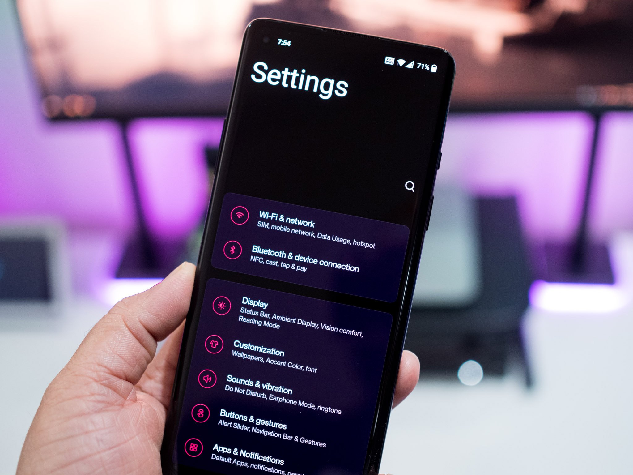
But one change that OnePlus users won't be so keen on is the new design. OxygenOS always stood out for its clean user interface that's inspired by stock Android, with the skin likened to Google's Pixel Launcher on steroids. That's changing with OxygenOS 11 as OnePlus introduces a new design language that's more in line with Samsung's One UI than Pixel and Android One phones.
OxygenOS 11's design is inspired by One UI, and the changes will rankle OnePlus' vocal userbase.
That's a controversial move by OnePlus, as the vanilla Android interface was what drew a lot of users to OxygenOS in the first place. The uncluttered interface coupled with meaningful additions like native screen recording, Zen Mode, and customization options allowed OxygenOS to stand out from the pack.
I've said several times in the past that OnePlus' skin is the best you'll find on Android, and a lot of that had to do with the fact that the interface was clean. With OxygenOS 11, OnePlus has shifted to a heavily skinned interface that looks very different to what you get on vanilla Android, with the manufacturer taking a lot of design cues from Samsung. A lot of the menu elements now sit in the lower 2/3rd section of the screen, and the large headers along with the increased font size makes the skin near-identical to One UI.
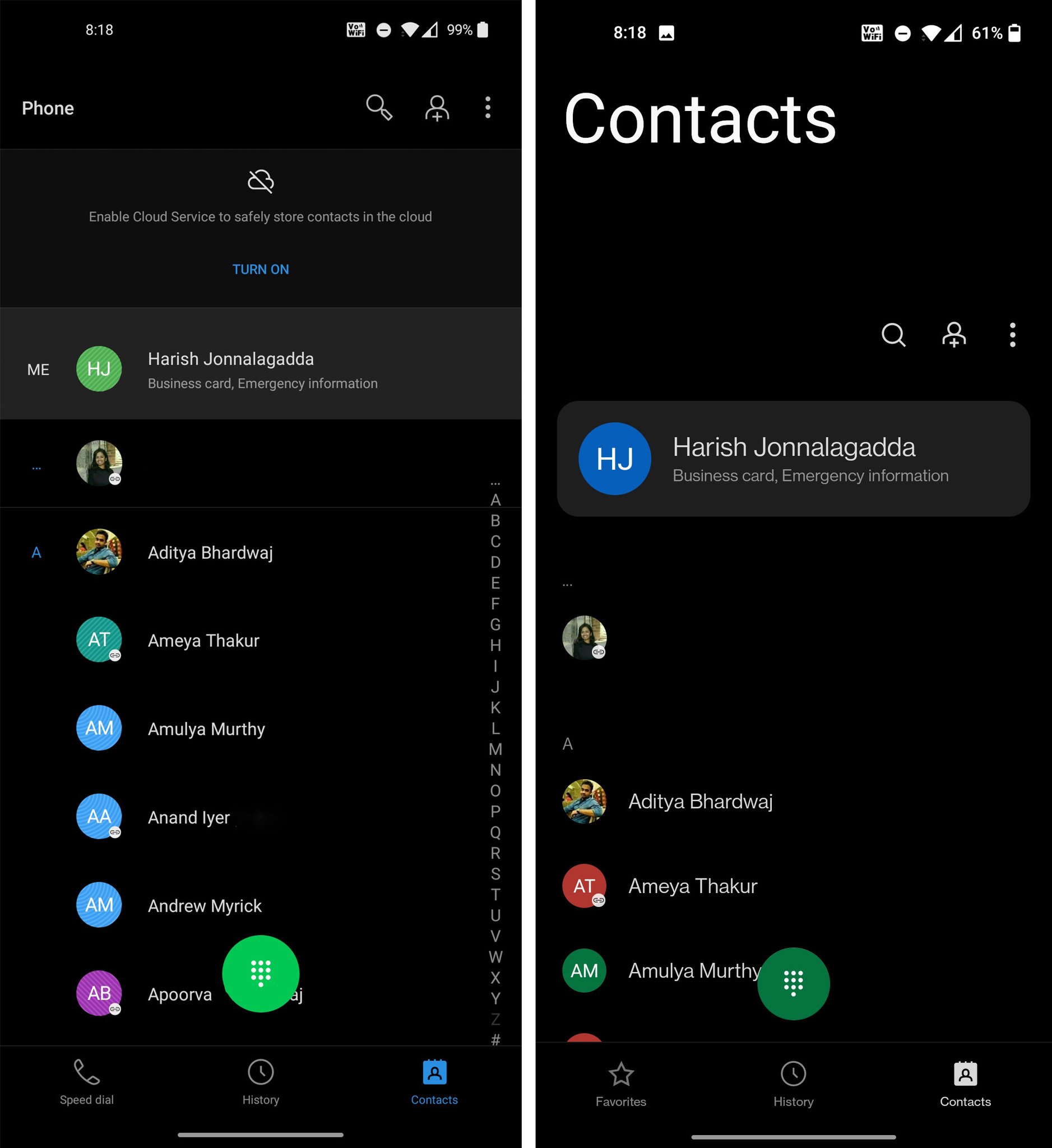
OxygenOS 10 on the left, OxygenOS 11 to the right
The difference is stark when using the dialer, messages, and other OnePlus first-party apps side-by-side with their OxygenOS 10 counterparts. There's a lot of added design flair now, and I'm not a fan of the overt customization. OnePlus didn't really need to make any changes to the user interface — it is one of very few manufacturers that has a vanilla Android UI — but with OxygenOS 11, that is no longer the case.
OnePlus styled its hardware after Samsung flagships; it's now doing the same with software.
As OnePlus starts becoming a mainstream player, it is losing the core tenets that endeared the company to a lot of power users. OnePlus flagships in recent years have featured a lot of hardware elements from Samsung's Galaxy S series, and with the new software direction with OxygenOS 11, the company is doing the same with software as well.
Combine this with the uninstallable Facebook bloatware on the OnePlus 8 series, and it's easy to see that the manufacturer is shifting away from its roots. It's understandable why OnePlus would want to emulate Samsung in this area. Samsung is the largest Android manufacturer by some margin, and more users are familiar with One UI than stock Android. But by taking on this new direction with OxygenOS 11, OnePlus is leaving its loyal userbase behind, and relinquishing its position as the best Android skin in the process.
It's becoming increasingly evident that OnePlus wants to be more like a mainstream phone manufacturer — that much is clear when you consider the positioning of the OnePlus 8 series — and with OxygenOS 11, we're seeing just how thoroughly the company is intent on copying Samsung.
Get More OnePlus 8
OnePlus 8 & 8 Pro


No comments